Can’t figure out how to grow your online course business?
I know that feeling!
Nothing can feel more frustrating than realizing the need to grow your business, but being clueless about what exactly to do about it.
In this post, I want to talk to you about a significant issue that’s stopping online course creators from growing their business, called Learning Friction™.
But before I get started on Learner Friction™, I want to highlight the importance of user experience for online course success. For modern learners, thoughtful, intuitive, and personalized experiences are what make good learning platforms outstanding.
“User experience” is more than just clean and effective visual design, it includes page speed, usability, and even customer service. The moment users interact with your online course platform, they’ll respond positively or negatively, depending on how easy and enjoyable the experience is.
If you ensure a streamlined user experience that meets customer needs and expectations, you aren’t just making the platform look different, you are making the complete learning experience different—you are providing impactful learning!
It’s a straightforward way to increase your profitability. MORE HAPPY CUSTOMERS = MORE PROFITS!
What is Learner Friction™?
Learner friction is everything that hinders students from achieving their desired results through your learning course platform. It’s every small problem that presents a hurdle to a fluid frictionless and intuitive learning experience is included in the broader definition of learner friction.
Learner friction is the main reason behind declining conversion rates, increased bounce rates, and overall heightened user dissatisfaction. For example, no online course creator would want to lose students because the site interface is not user-friendly.
Various factors go into evaluating the learner friction that is present in your platform. Understand your current status by asking yourself these questions:
- Do you analyze student journey to find out exactly where could they be getting stuck?
- Is your site/course mobile-responsive?
- What is your average lesson duration? Are they longer than 20 minutes?
- What is your site load speed rating? There are several platforms that conduct such site speed tests such as GTMetrix.
The key to increasing online course profitability lies in optimizing the student journey throughout the platform – which is only possible by reducing learner friction.
Creating A Frictionless E-Learning Experience
As organizations continue to optimize consumer journeys throughout the conversion funnel, there is a growing number of ‘frictionless’ platforms and websites (ex: Netflix, Spotify, and Amazon). Your learners are familiar with these user-friendly platforms, and they are expecting the same experience in your course. Students expect eLearning platforms to deliver the same level of enhanced UX, which can ensure a positive learning experience.
How To Prevent Friction
Learner friction is primarily caused by bad UX design which does not address user needs. Here are six steps that you need to take to create a frictionless e-learning experience for your students:
#1: Do Your Research
You cannot create the perfect learning experience for your students unless you know what they look (read: behave) like. In order to drive high completion rates, repeat purchases, fewer refunds, and become a successful business, everything you design has to cater to your core target audience.
For an online course to be effective, the learning experience must be easy and flow naturally for every user regardless of their age, skills and job title. Great user experiences happen when course creators know their target audience.
The preliminary step includes extensive research into your consumer’s behavioral patterns. This may require you to dig deep into internal data, and conduct surveys, distribute questionnaires and do everything necessary to formulate a buyer persona.
This may also include looking at your competitors, and how they have customized their design for their target audience.
It is not surprising if you end up having multiple student personas. If that is the case, you can A/B test through different aspects of your online presence to see what produces the best results. It’s important to remember that the foundation of every successful consumer-centric platform lies in consumer behavior analysis.
#2: Maximize the time students spend time learning
Did you know one of the biggest drivers of poor completion rates is complex navigation on a course? Devoid of a clear understanding of what the next step should be, users are left stranded and often resort to abandoning the platform entirely.
Particularly in the case of digital learning experiences, online course creators should emphasize on the placement and clarity of call-to-action buttons that direct users towards the next step. Buttons such as ‘Next Step’ or ‘Continue’ should be readable, and visible to students to support streamlined progress.
Reducing friction and having students spend maximum time learning is the key to profitable courses. Here’s when you are going to see the massive ROI increase in your business!
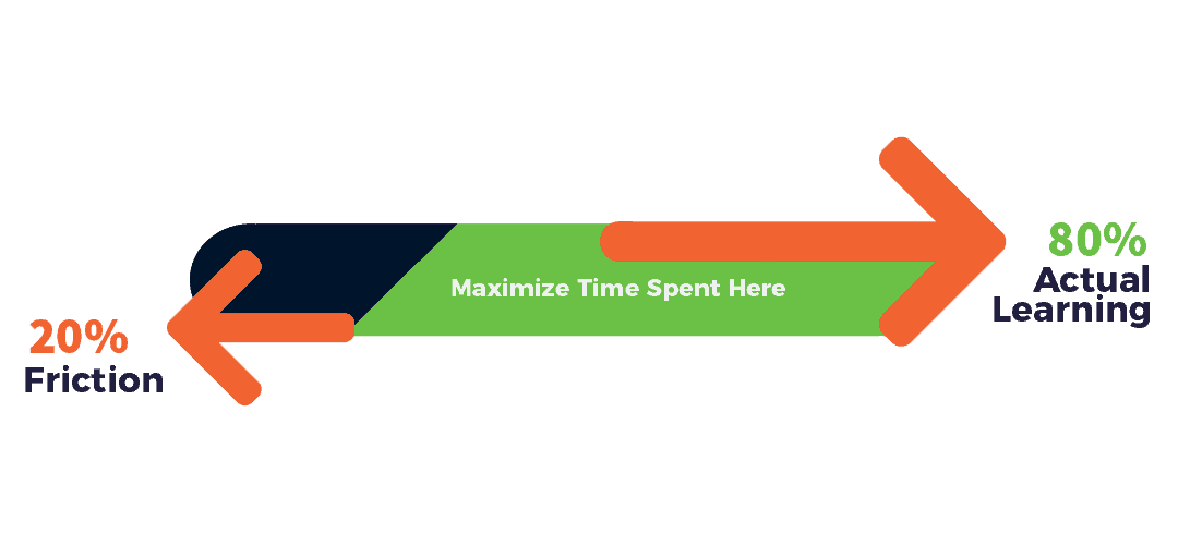
If much of a learner’s time is wasted combating friction, frustration will arise, and getting the results they desire will take more time. By optimizing your platform for exemplary user experience, you are essentially providing learners with a chance to save time, complete your course, and get the outcomes they desire.
As the image above demonstrates, the time that learners save can, therefore, be utilized to increase the time that they actually spend on your platform learning.
The hallmark of great navigation is that it appears to be virtually invisible for the users. What I mean by this is, that users are not actively looking for navigation design features, but through strategic placement, they are subconsciously aware of the next step.
However, clarity entails more than just navigation. Online course creators need to ensure that the student always has a clear indication of their current level of learning. This can be done by integrating options such as direct access to a prominent progress bar. For instance, students should be provided with a clear indication of their level of mastery throughout the course.
#3: Chunking Technique
In such a crowded digital space, your students are already suffering from information overload.The ultimate recipe to drive learners away is by exposing them to massive amounts of content straight away.
The ‘chunking’ technique leverages human limitation to absorb complex content by dividing such information into well-spaced smaller sections to improve perception and retention. It is a major rule of UX design, and allows users to absorb content in smaller chunks.
Learn more in this article I recently wrote.
#4: Understand User Intent
Many problems that are associated with bad UX designs can be traced back to a business’ inability to perceive the intent, and emotions that drive their consumers.
As an online course creator, it can be tempting to think that the way you dish out information is how your students like it. Unfortunately, it doesn’t work that way.
You should consider the emotions that your UX design, and website in general, evoke from your consumers. Is your platform too confusing for a new student? Does your tone come across as cold or unwelcoming?
Read more: Creating a UX design that users interpret correctly
When the UX design of your website or platform ensures that your students feel welcome, you have a greater chance of retaining them through the entirety of the course.
This leads us to the next point.
#5) Optimize the Experience with Student Feedback
While online course creators typically take feedback from design experts when finalizing their product, they don’t follow up after they go live.
However, only when the course goes live is when students have a chance to check each and every aspect of the experience. Here is when can they come up with valuable feedback or identify potential drawbacks of your new or updated UX design.
Go a step further, and conduct feedback polls to ensure that you are on the right track. As a platform built for your students, it is imperative to pay due attention to what they have to say.
Consider this: while not an eLearning platform, leading sports news site ESPN.com managed to increase their revenue by 35% after they incorporated suggestions from their online community into their UX/UI design.
Overall, improvements to your platform is a continuing process, as opposed to a one-time fix. Once you go live, you should ensure regular maintenance and updating as part of your routine.
In an industry riddled with consumer engagement issues, reducing learner friction should headline your objective as an online course creator.
As consumers continue to be exposed to positive and user-friendly experiences in every aspect of their lives, it is time for the eLearning industry to learn how to create frictionless learning journeys.
{{cta(‘f117a954-887a-4df7-a7b2-6478c42e810d’)}}
Recent Comments